Branding / Web Design & Development

BuildFT: A bold identity and digital system
built for a modern construction brand

Founded by Xiao Hu and Jason Ryu, BuildFT is a New York City general contracting firm built on a simple idea: construction in this city can be done better. Oak Theory built the identity, the website, and the print and collateral to carry it — from a business card to a jobsite sign.

Next case studySee more work
Client
BuildFT
Industry
Construction / Architecture / Design
Year
2026
Services
Brand Strategy, Visual Identity, Website Design, Creative Direction, Marketing Collateral, Art Direction
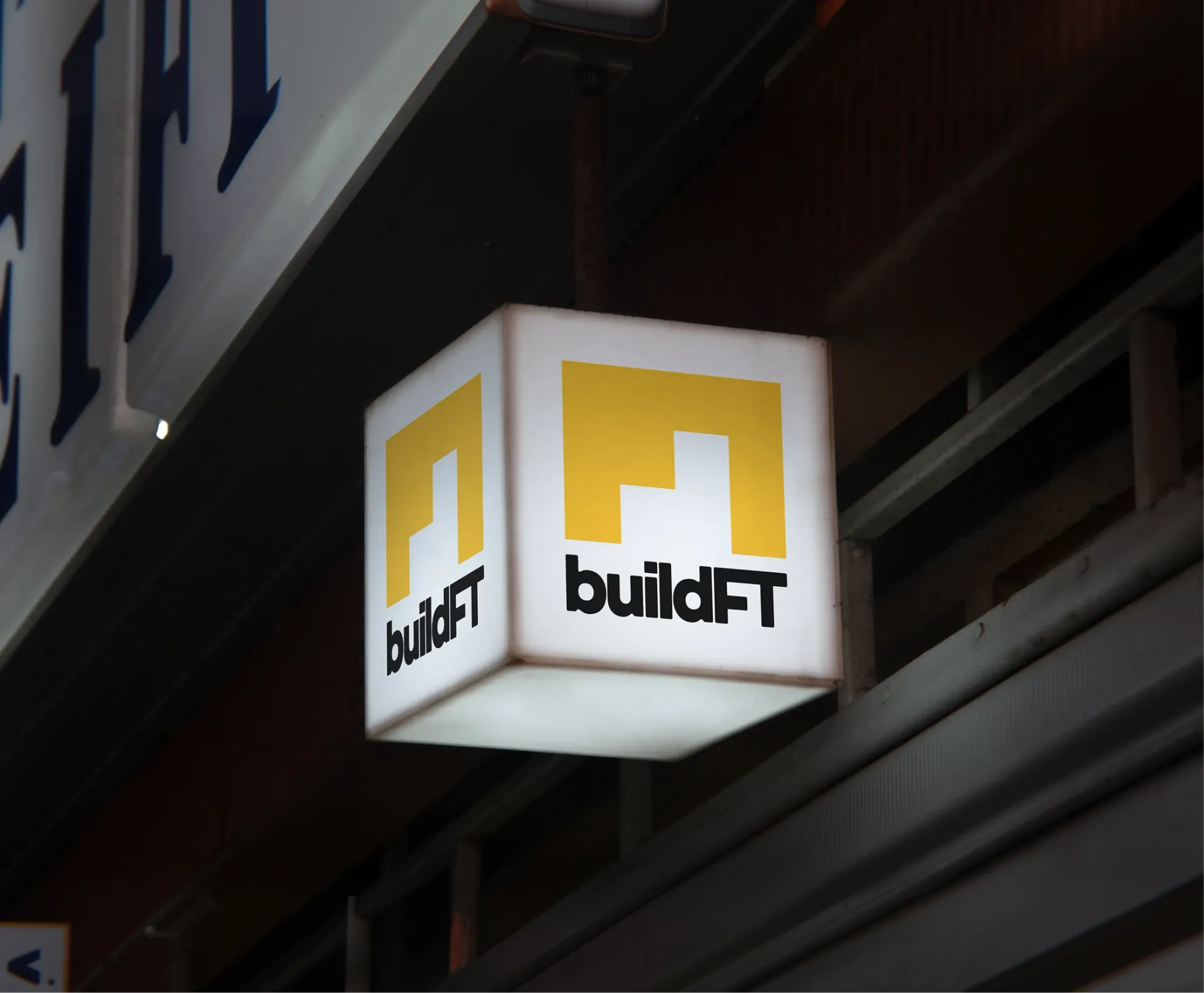
Illuminated BuildFT sign mounted on an exterior facade.

Quick answer

Oak Theory built BuildFT's brand identity, the buildft.com website, and the print and collateral system behind it. The goal was a general contracting brand that reads premium enough for developers and commercial tenants, and grounded enough to still feel true on a Long Island City job site — carried consistently from a business card to a helmet decal to a seven-page, image-driven site.

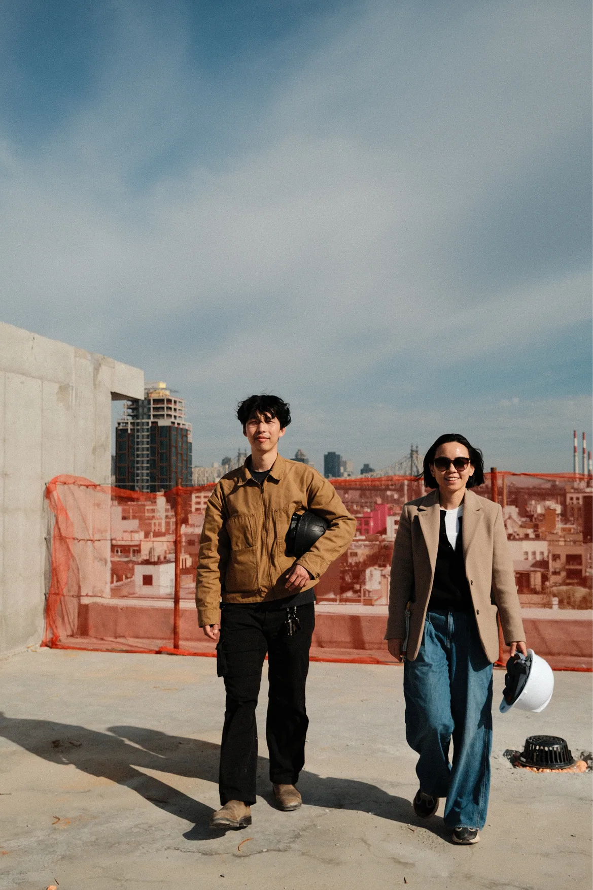
BuildFT team portrait on a rooftop construction site.

About

A construction brand with cultural presence.

Xiao and Jason didn't start BuildFT from nothing. Between them, they'd spent over a decade inside NYC real estate development and construction management — Xiao on the finance and acquisitions side, Jason running large-scale ground-up developments across Williamsburg and Long Island City. They knew exactly what they didn't want to repeat: unclear pricing, missed milestones, communication that disappears the moment a client needs it most. BuildFT was built to be the firm they always wanted to work with.

By the time they came to Oak Theory, the company existed. What it didn't have yet was a visual identity that matched the standard they'd set for the work itself — something that could hold up next to the developers and commercial clients they wanted to win, without losing the hands-on, jobsite credibility that makes a general contractor trustworthy in the first place.

The challenge

Making the work feel premium, not predictable.

Xiao and Jason were specific about what BuildFT shouldn't look like. They pointed us to their own backgrounds — firms with the kind of polished, corporate sites that felt disconnected from the actual work — and asked for the opposite: something fluid, warm, and design-forward, closer to interior design and architecture than to a typical GC website, but without losing construction grit.

That's a narrower target than it sounds. Most firms in this category pick a lane: rugged and forgettable, or polished and generic. BuildFT needed to read as premium enough to sit across the table from developers and commercial tenants, and grounded enough to still feel true on a Long Island City job site. Every direction we explored got tested against both.

What we did

Scope of engagement

Brand positioning & creative directionConsultingConsulting
Visual identity systemBrandingBranding
Website experience designWebsite DesignWebsite Design
Campaign & collateral explorationMarketing & PrintMarketing & Print

Our Approach

01

Defining a sharper brand language.

We grounded the visual direction in what's actually true about BuildFT: a 10+ year, NYC-based firm working across residential, commercial, and ground-up development, licensed and insured, run by founders with finance and construction management backgrounds.

The early "People First" language gave way to something sharper and more specific to how Xiao and Jason actually talk about the work: "Quality First." "Thoughtful by craft. Human by nature." Positioning that could carry a homepage headline or hold up in a client meeting.
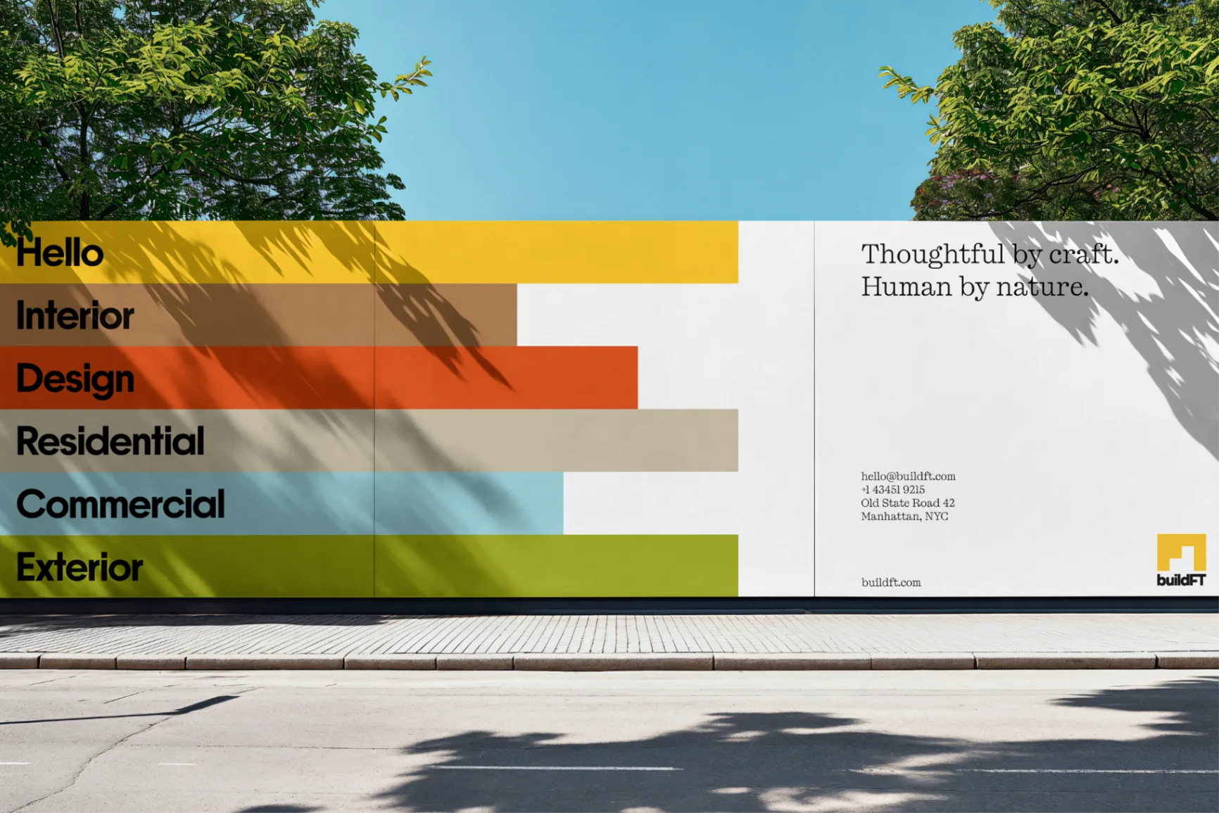
BuildFT large-format mural with colorful service bands and brand message.
02

Building a system that travels.

Mood boards were built around New York itself — Brooklyn brownstones, Long Island City's industrial edges, the texture of construction signage in the city BuildFT actually builds in — deliberately steering away from the softer, California-residential look that didn't fit a firm doing gut renovations and ground-up development in NYC.

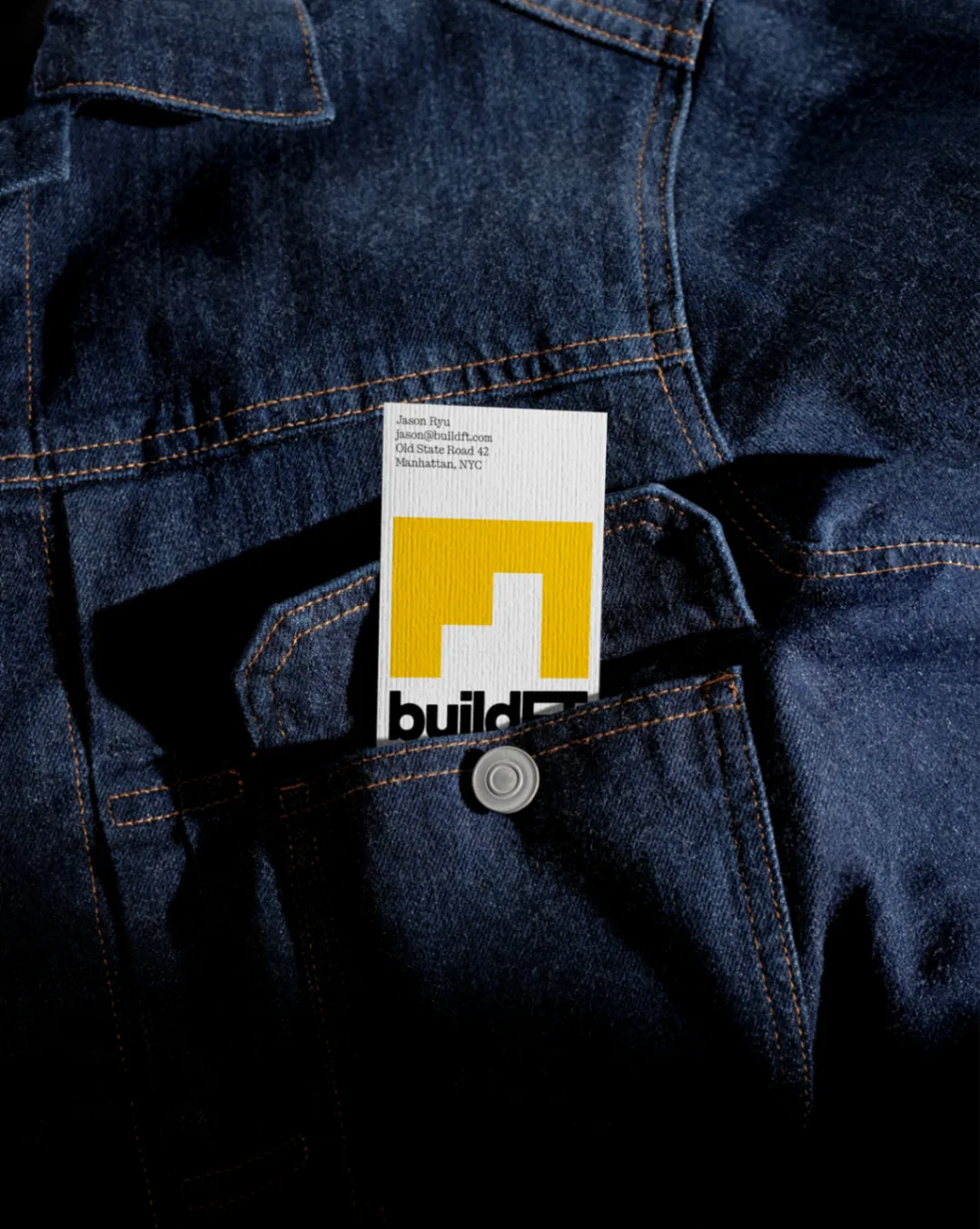
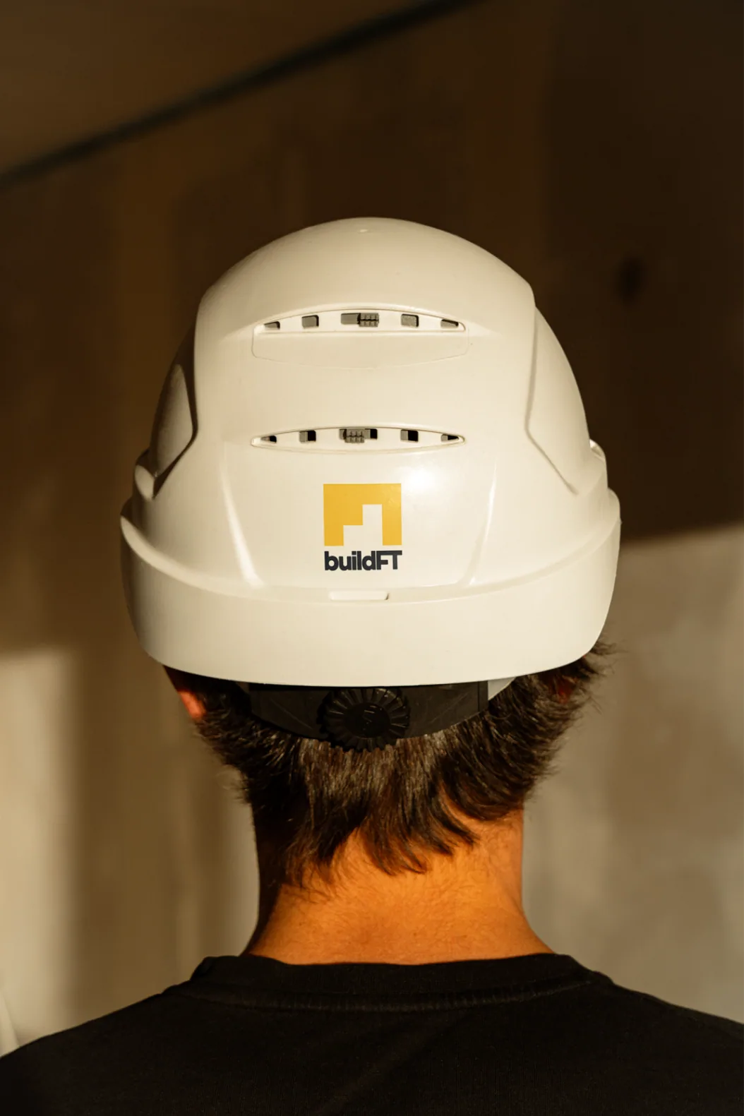
The resulting identity had to hold up everywhere BuildFT shows up: a business card in a denim work pocket, a helmet decal, a branded work shirt, a tote bag, a truck.

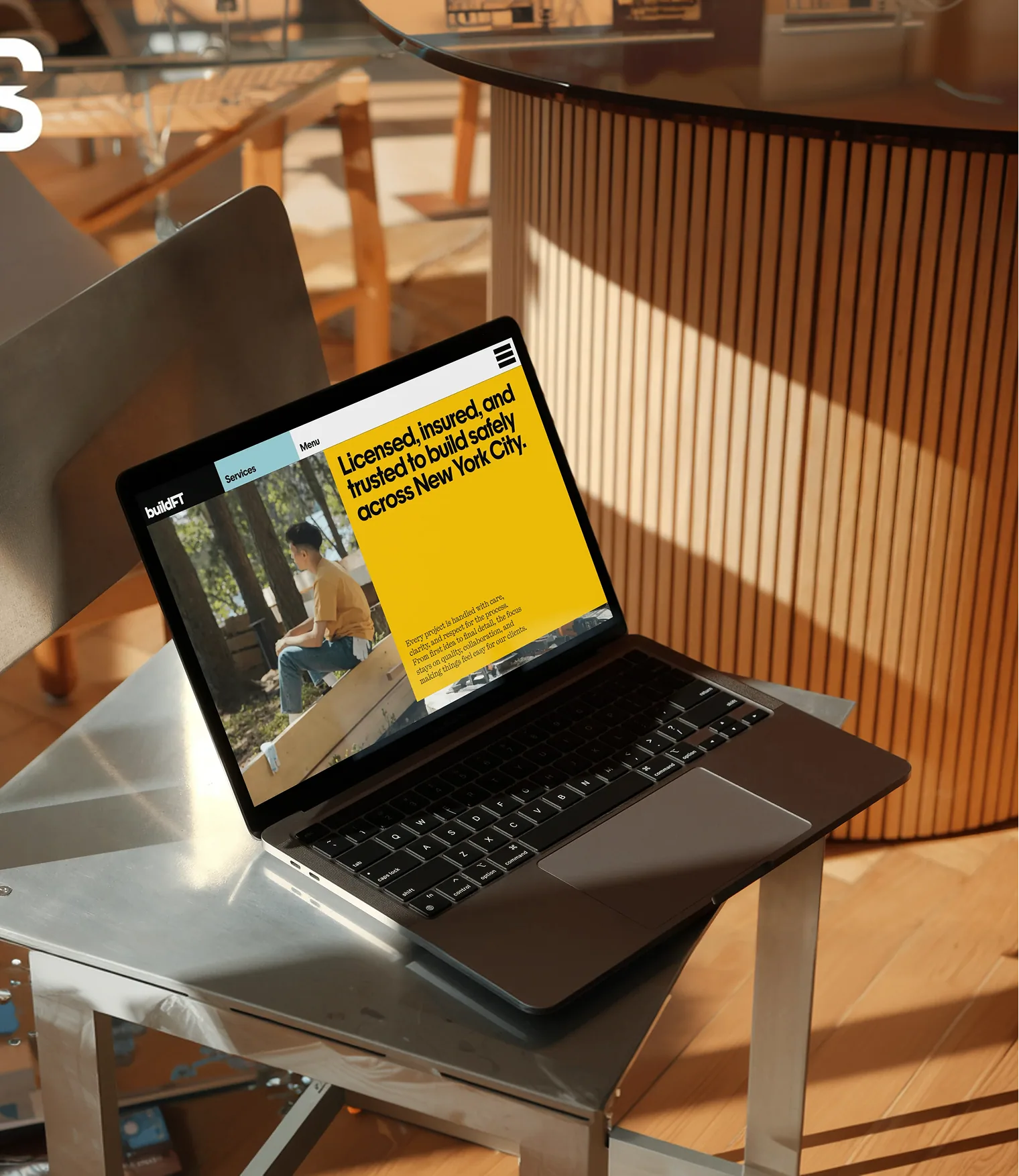
BuildFT website mockup displayed on a laptop in a warm interior setting.
03

Extending the brand into digital.

buildft.com is a seven-page site — Home, About, Services, Portfolio, Project Detail, Contact, and Blog — built image-driven and copy-light on purpose, at the client's direction, to let the work speak first.

The portfolio leads with real BuildFT projects: Rewind, a speakeasy-meets-KTV karaoke lounge in Long Island City; KK Nail Salon; and Dubu Hana. The About page carries Xiao and Jason's actual founder bios, with licensing and safety credentials front and center, since trust is half of what a GC is selling.

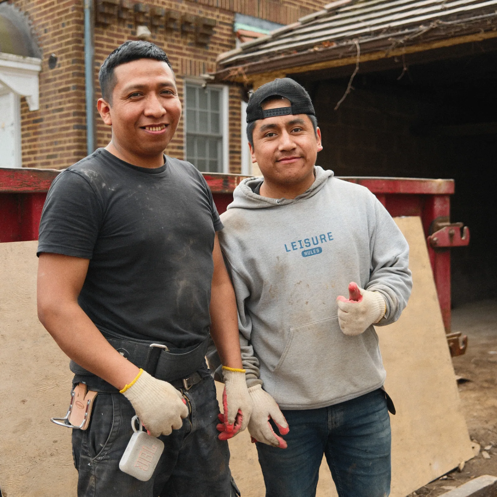
BuildFT crew portrait on site.
04

Designing for the brand beyond launch.

Launch wasn't the finish line. We handed off a CMS Xiao and the team could run themselves, walked through it directly with her, and built out the print and collateral so the brand shows up the same way whether it's on-screen or on a job site.

  • Business cards designed to survive a work pocket.
  • Apparel and gear across shirts, helmets, and totes.
  • Jobsite signage that gives the brand a public-facing presence.
  • A client-run CMS so the site keeps pace with the portfolio.

Selected work

Design details

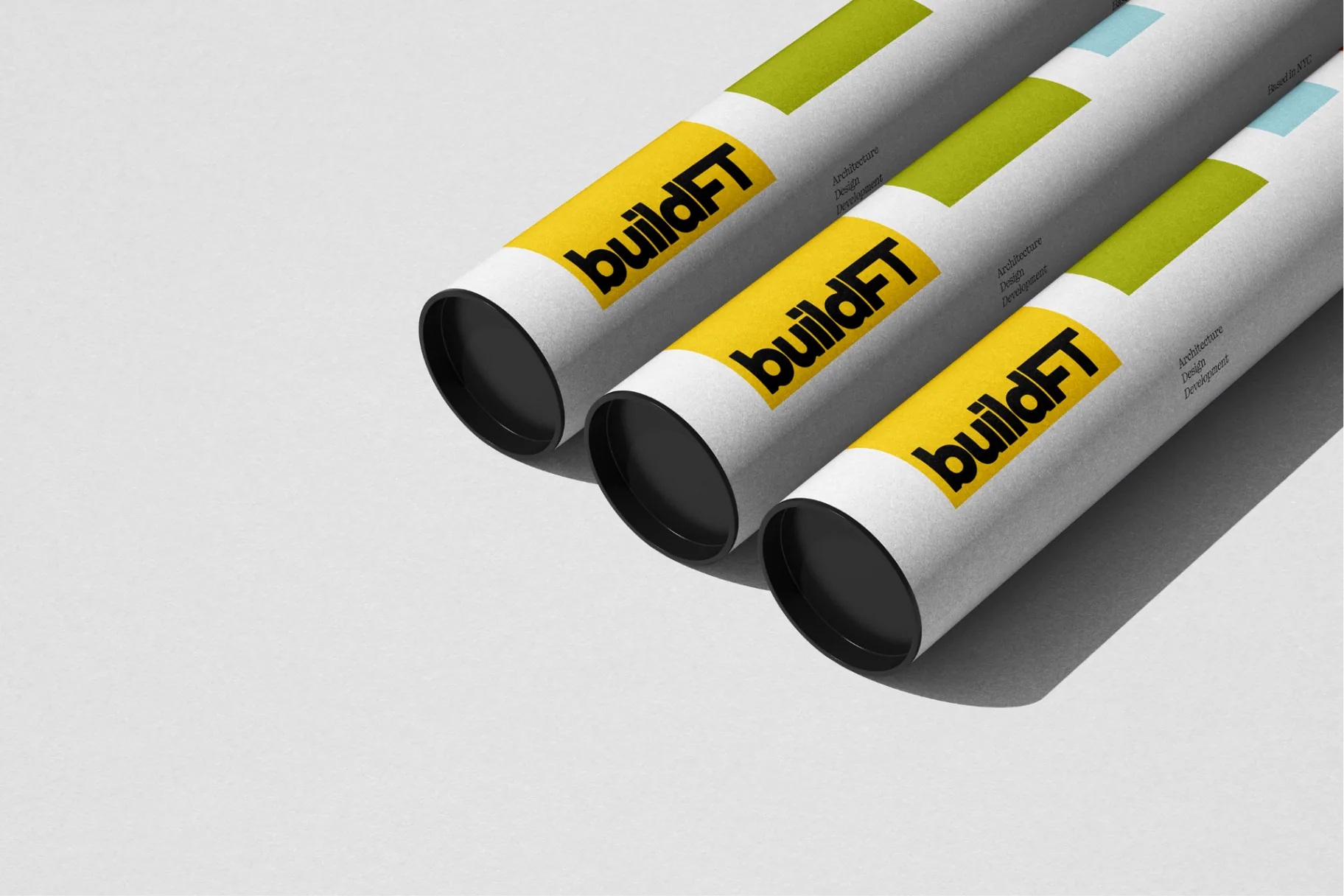
BuildFT blueprint tubes with brand system applied.
BuildFT business card tucked into a dark denim jacket pocket.
BuildFT logo applied to the back of a construction helmet.
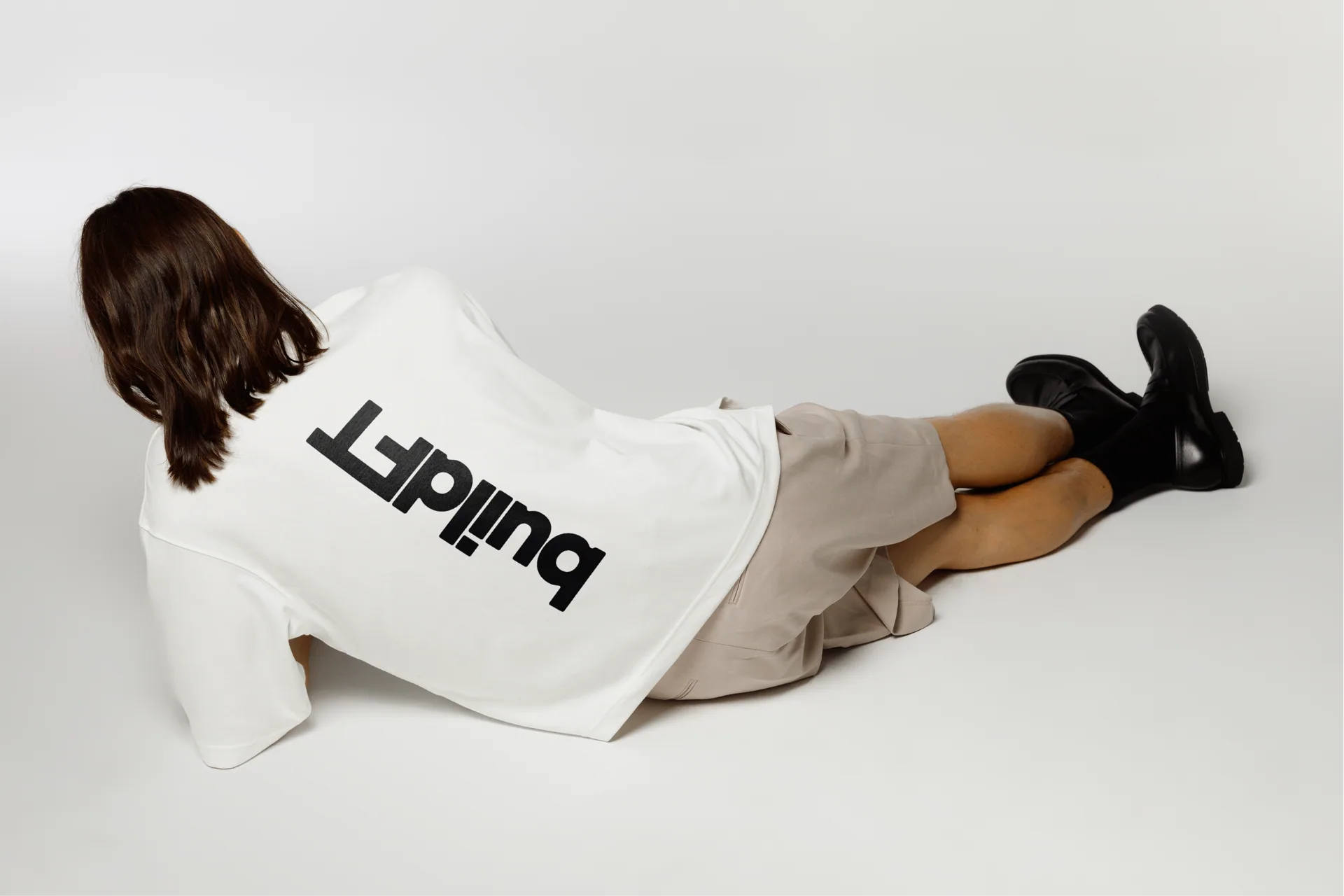
BuildFT branded white shirt photographed in studio.
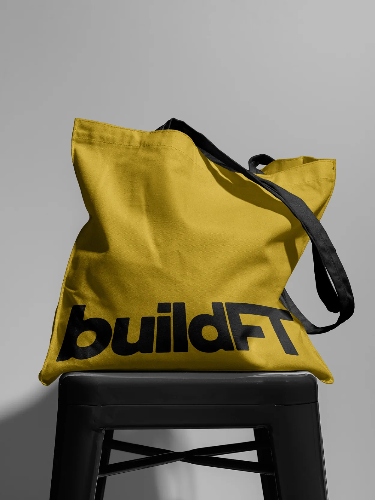
BuildFT branded tote bag displayed on a stool.

FAQ

Frequently asked questions

Building something that
deserves a brand this good?

Let's talk about what a system built to travel could look like for you.

Start a project